Imagine being able to express your creativity while crafting a personalized message for someone special. In this guide, we’ll explore how to create stunning custom greeting cards using Prismacolor Premier Double-Ended Art Markers. These markers offer a vibrant range of colors and versatility that can transform simple designs into impressive works of art.
Whether you're a seasoned artist or just starting out, this guide will walk you through fun techniques to bring your greeting card ideas to life. From blending colors to mastering the fine and chisel tips, you'll discover how to unlock the full potential of your Prismacolor markers and leave a lasting impression on every recipient.

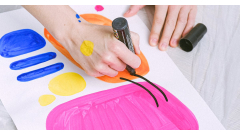
The Prismacolor Premier Double-Ended Art Markers are a must-have for any artist or hobbyist. Featuring both fine and chisel tips in a set of 12 vibrant colors, these markers are designed to deliver precision and boldness in every stroke. Their blendable ink allows for seamless color transitions, making them perfect for creating dynamic designs on greeting cards and other art projects. Durable and easy to use, these markers help elevate your creativity to new heights.
Gather Your Supplies
Creating exquisite custom greeting cards with Prismacolor Premier Double-Ended Art Markers requires a thoughtful selection of supplies to help you bring your artistic vision to life. Start with quality card stock; a heavier weight, such as 80 lb to 110 lb for sturdy bases, is recommended for durability. Opt for smooth, bright white card stock, which offers an excellent canvas for the vibrant colors of your Prismacolor markers, enhancing the final look of your designs.
In addition to card stock, gather the following essential materials to ensure a seamless crafting experience:
- Scissors: For precise cutting of your card stock and any decorative elements you may wish to add.
- Ruler: To create straight edges and measure dimensions accurately when folding or cutting.
- Pencil: For sketching initial designs, allowing you to plan your artwork before applying ink.
- Prismacolor Premier Double-Ended Art Markers, Fine and Chisel Tip, 12 Pack: These markers provide versatility with their dual tips, perfect for both fine details and broader areas of color.
Having a paper trimmer on hand can be advantageous for achieving clean, straight cuts. Additionally, a blending palette may help you experiment with color mixing, achieving unique shades that make your cards stand out. Finally, consider incorporating embellishments like stickers or washi tape to personalize your cards further.
- Paper trimmer: For efficient and straight cuts.
- Blending palette: To try out color combinations.
- Embellishments: Stickers, washi tape, or ribbon for a decorative touch.
Design Your Card Layout
Creating a custom greeting card with Prismacolor Premier Double-Ended Art Markers involves thoughtful planning and intention right from the outset. Begin your design process by brainstorming ideas related to the occasion you’re celebrating. Capture your thoughts by jotting down words, phrases, or sketches that inspire you. Think about the recipient's interests, favorite colors, and any themes you want to convey, which can add a personal touch to your card. Brainstorm multiple concepts—sometimes an unexpected idea can yield the most delightful results.
Next, move to sketching out your initial card design lightly with a pencil on cardstock. This will act as a foundation for your layout. Consider the placement of text and images carefully, ensuring that your main visual elements are central and easy to see. Achieving a balanced composition is crucial; distribute visual weight evenly across the card. You might want to use the fine tip of your Prismacolor markers for intricate details and the chisel tip for filling larger areas or creating backgrounds. Think about the rule of thirds while placing elements on the card to guide the viewer's eye seamlessly across your design:
- Use ample white space to avoid a cluttered look.
- Experiment with different orientations (horizontal or vertical) to see what works best.
- Incorporate textures and patterns carefully to keep the design cohesive.
- Mix and match colors within the 12-pack to create eye-catching contrasts.
- Plan your text placement, making sure it is readable and complements the illustrations.
Understanding Marker Techniques
When creating custom greeting cards with Prismacolor Premier Double-Ended Art Markers, mastering various marker techniques can significantly enhance your designs. These markers feature both fine and chisel tips, providing versatility that caters to different styles and effects. Familiarizing yourself with blending, layering, stippling, and shading can elevate the overall appearance of your cards.
Blending is essential for achieving smooth transitions between colors. Start by selecting two or more shades of the same color family, such as light and dark blues. Use the fine tip for precise application, laying down the lighter shade first, then overlaying with the darker one while they are still wet. This technique creates a seamless gradient that works wonderfully for backgrounds or subtle highlights. Layering, on the other hand, involves building up color by applying multiple layers of ink. Begin with a lighter color and gradually add darker shades to deepen areas of your design. This approach is effective for creating dimension in objects like flowers or landscapes.
- Use the chisel tip for broad areas or backgrounds.
- Consider working on a textured paper for added visual interest.
Stippling, which involves dotting rather than stroking, can bring a unique texture to your greeting cards, perfect for creating patterns or shading. This technique works extraordinarily well with the chisel tip due to the ability to create various dot sizes by altering pressure. For shading purposes, focus on where the light would naturally fall and layer dots in those areas to create depth. Lastly, for more dynamic shading effects, try incorporating a flicking motion with the fine tip marker to emulate texture in fur or foliage. These techniques are not merely applications of color; they help to tell a story with your artwork.
- Experiment with different pressures using both tips to see different textures.
- Always allow layers to dry before adding more to prevent smudging.
Creating Backgrounds
Designing beautiful backgrounds for greeting cards using the Prismacolor Premier Double-Ended Art Markers can truly elevate your artwork. With their rich pigments and variety of tips, these markers are perfect for creating different background styles. Start with solid colors for a bold effect. Choose a marker with the fine tip to fill in small sections and achieve a uniform shade, or use the chisel tip for larger areas. Opt for complementary colors to your main design—think warm yellows alongside cool blues to make elements pop. Remember to layer colors by starting with a lighter base and gradually adding darker tones to create depth.
For a more dynamic look, consider gradients. Select two or more colors that transition smoothly. Use the fine tip to apply the lighter color first, and as you move to the darker color, slightly overlap with the previous shade. To blend effectively, use a circular motion with the fine tip to merge the colors together seamlessly. Abstract backgrounds can add an artistic touch—experiment with squiggles or dots using different marker tips. Mix colors randomly but harmoniously, focusing on balance rather than structure. These steps will help you create visually appealing backgrounds that enhance your greeting cards.
- Solid Colors: Choose vibrant hues and apply using fine or chisel tips for coverage.
- Gradients: Layer colors gradually, blending with circular motions for a smooth transition.
- Abstract Designs: Use squiggles, splashes, or dots for a creative flair, balancing colors thoughtfully.
Incorporating Text Elements
Adding text to your custom greeting cards can elevate their charm and personalization. When using Prismacolor Premier Double-Ended Art Markers—known for their vibrant colors and versatile fine and chisel tips—discovering the right font styles, sizes, and placements can make a significant impact. Consider using a mix of cursive and block letters to create visual interest; cursive offers elegance while block letters provide clarity. Experimenting with different font sizes can also help to emphasize key messages, such as “Happy Birthday” prominently in larger lettering, while secondary details can be smaller but still legible. For a balanced look, aim to leave enough white space around your text to prevent overwhelming the card.
Choosing colors that not only stand out but also complement the overall card design is essential. To achieve this, think about your background colors; contrasting hues can enhance readability. If your background is a soft pastel, opt for bolder colors like deep blues or reds for your text. For cohesive designs, select colors from the same family; for instance, using lighter shades of the same color for text against a darker background can create a harmonious look. Testing your colors on scrap paper before applying them to the card can help you visualize the final outcome.
- Mix cursive and block letters for visual interest.
- Leave enough white space around the text.
- Choose contrasting colors that stand out against the background.
- Opt for harmonious color schemes within the same family.
Layering Colors for Depth
Creating visually captivating greeting cards involves skillfully blending colors to achieve depth and richness. With the Prismacolor Premier Double-Ended Art Markers, featuring fine and chisel tips, you can enhance your artistic expression by mastering the technique of color layering. Start by selecting a color palette that evokes the desired mood of your card. Look for complementary colors that can create harmony, or bold contrasts that add excitement. For instance, pairing a soft lavender with a rich plum can add dimension, while shades of teal and navy create a dramatic effect.
When you’re ready to layer colors, begin with the lighter shade using the fine tip of your Prismacolor markers. This allows for precision and control as you lay down your base color. Gradually add the darker tones using the chisel tip. The broader surface allows you to cover more area quickly, offering a beautiful transition between colors. As you layer, utilize short strokes and blend the colors with a soft hand to avoid harsh lines. Don’t forget to experiment with different combinations and intensities until you achieve your desired depth.
- Choose a light base color for the initial layer.
- Use the fine tip for detailed areas and the chisel tip for larger sections.
- Blend colors gradually to avoid sharp contrasts.
- Experiment with combinations to discover unique effects.
- Use lighter markers to soften edges and enhance the overall look.
Adding Finishing Touches
Enhancing the design of your custom greeting cards with Prismacolor Premier Double-Ended Art Markers can truly elevate your artwork. To start, consider the impact of adding outlines. Using the fine tip of your Prismacolor marker, trace around the main elements of your illustrations. This not only adds definition but also creates a polished look. Experiment with colors that contrast sharply with your base tones; for instance, a dark blue outline around a vibrant yellow floral design can make the flowers pop. Furthermore, highlights are vital in creating depth. Use a lighter shade of the same color family to add dimension to your designs. By gently applying small strokes at the edges or along the curves, you can simulate light reflections, making each element more visually appealing.
Assessing when your card is complete involves stepping back and visually evaluating your work. Ask yourself if every element serves a purpose or enhances the overall design. If something feels off, don’t hesitate to refine the edges. Utilize the chisel tip for broader areas, ensuring smooth and clean lines that can distinguish different parts of your illustration. If mistakes occur, Prismacolor markers feature a rich pigment that can be layered. Lightly layering over an error can often obscure it without damaging the card’s integrity. Here are some additional techniques to further refine your greeting card:
- Add embellishments like stickers or washi tape for extra flair.
- Consider using metallic or glitter pens for additional highlights, providing an eye-catching sparkle.
- Incorporate textured backgrounds using watercolor or pastel techniques before adding your markers.
Related Products


Creating Envelopes
Designing custom envelopes to complement your greeting cards made with Prismacolor Premier Double-Ended Art Markers can add a personal touch that impresses recipients. To start creating your envelopes, you will need a sturdy paper that is at least 80 lb in weight to ensure durability. This will provide a nice canvas for your designs. The standard size for a greeting card is 5" x 7", which means your envelope should be slightly larger to accommodate it comfortably. A great size for the envelope would be 5.25" x 7.25". Cut your paper to this size using a paper cutter for clean edges.
Once you have your base, fold the bottom up about 2.5" to create the envelope’s base and then fold in the sides, overlapping them slightly in the center if you prefer a more cohesive look. Use adhesive or double-sided tape to secure these folds. Now is the time to unleash your creativity! Use your Prismacolor markers to draw designs, doodles, or even elaborate patterns on the front. Consider using light, pastel colors for a subtle touch or bold shades for more impact. Incorporate elements that match your greeting card's design style.
- For a matching palette, reference the colors used in your card while decorating your envelope.
- Add details such as flowers, geometric shapes, or even a hand-lettered recipient’s name using the fine tip of your Prismacolor markers.
- Utilize metallic or glitter pens for accents to make your envelopes stand out even more.
Packaging and Presentation
Giving your custom greeting cards a polished look is vital for making a lasting impression. One of the simplest ways to elevate your cards is through the use of clear bags. These protective bags not only keep your artwork safe from dust and damage but also allow the recipient to glimpse the design immediately. Choose bags that fit the size of your cards snugly, such as 4.5 x 6.25-inch clear plastic bags for standard A6 cards, ensuring a neat and professional presentation. Adding a decorative element like a ribbon or twine around the top of the bag creates an appealing visual and adds a handmade touch. Using natural materials, like jute or linen ribbons, can enhance the charm of your card, especially for occasions like weddings or birthdays, making them even more inviting to open.
Considering labels can also enhance the packaging experience. A well-designed label that reflects the theme of your greeting card can tie the entire package together. You could print labels that include a short personal message or the occasion, such as "For You" or "Happy Birthday." If you’re planning to sell your greeting cards, branded labels with your logo can turn a simple card into a product that represents your artistic identity, increasing brand recognition among customers. Furthermore, for gifting, consider using themed packaging or even incorporating small embellishments like dried flowers or stickers on the envelope. Each detail adds to the recipient's excitement and reflects the love and creativity you poured into the cards.
- Use clear bags for protection and visibility.
- Incorporate ribbons or twine for a personal touch.
- Design and use labels that reflect themes or occasions.
- Experiment with themed packaging and embellishments for gifting.
Storing and Caring for Markers
To ensure that your Prismacolor Premier Double-Ended Art Markers remain vibrant and ready for use, proper storage and maintenance are essential. Begin by storing the markers horizontally when not in use. This positioning helps maintain ink distribution between the fine and chisel tips, preventing any drying out. If you prefer to store them upright, always keep the caps down to avoid excessive air exposure to the nibs. Using a marker case or a dedicated storage container can keep the markers organized and protected from light and dust, which can also damage them.
To prevent your markers from drying out, make it a routine to securely cap them immediately after use. Additionally, throughout your creative sessions, be mindful of the environment. Avoid placing the markers near heat sources or direct sunlight, as excessive heat can cause the ink to evaporate. In the event of any spills or stains during use, promptly clean them up using a damp cloth. This not only preserves the integrity of your workspace but also keeps your markers in prime condition for future projects.
- Store markers horizontally to ensure even ink distribution.
- Keep caps securely closed to prevent drying.
- Maintain a cool, dry environment for optimal marker longevity.
- Use a damp cloth for cleaning any spills to protect your workspace.
- Invest in a dedicated storage solution for organization.
Why We Chose This Product
Choosing Prismacolor markers for this how-to guide was a natural decision. Their quality and reliability make them perfect for detailed work, and their vibrant ink allows for creativity without limitations. With their double-ended design, you'll have the flexibility to create intricate designs as well as bold strokes, ensuring that every card you produce stands out.
- Wide range of vibrant colors
- Fine and chisel tips for different styles
- Blending capabilities for depth and dimension
- Durable ink for lasting results
By investing your time in crafting these personalized greeting cards, you're not just sending a message; you're offering a piece of your artistry. With the right tools at your disposal, let your personality shine through every card you create.
The Prismacolor Premier Double-Ended Art Markers are a must-have for any artist or hobbyist. Featuring both fine and chisel tips in a set of 12 vibrant colors, these markers are designed to deliver precision and boldness in every stroke. Their blendable ink allows for seamless color transitions, making them perfect for creating dynamic designs on greeting cards and other art projects. Durable and easy to use, these markers help elevate your creativity to new heights.